EliteSquat is a mobile fitness app designed to help busy working professionals stay active and motivated through short, personalized workouts and yoga sessions that can be done anywhere, anytime.
The app focuses on time efficiency, emotional motivation, and habit formation, combining guided workouts, progress tracking, and community support into one seamless experience.
Who (Role & team)
My Role: UX / UI Designer (solo project)
Team: Self-directed case study for UX design portfolio (based on user research and design thinking framework)
Target Users: Professionals aged 25–40 who want to stay fit but struggle with consistency due to time constraints.
Design Goals
To create a simple, motivating, and flexible workout experience that empowers busy users to stay consistent with daily movement — even if they only have 15 minutes per day.
User Story
Persona Name: Anna Age: 29 Occupation: Marketing Manager at a consulting firm Location: Berlin Pain Points:
Long workdays and unpredictable meetings
Too tired to go to the gym
Feels guilty for never having time for herself
Often starts workout apps, then loses motivation after a week
Goal: To stay healthy and energetic without complicated plans — just short, effective workouts she can do at home
Research And Insights
Methods: 5 user interviews Key insights:
80% skip workouts due to fatigue after work.
60% want workouts under 15 minutes.
Users feel more motivated when tracking streaks and seeing community challenges.
“Many busy professionals want to stay fit, but lack time, motivation, and structure for consistent home workouts. The goal was to understand what prevents consistency and how an app can support motivation.”
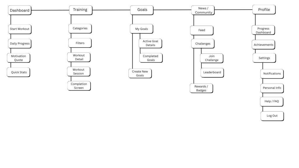
Information Architecture
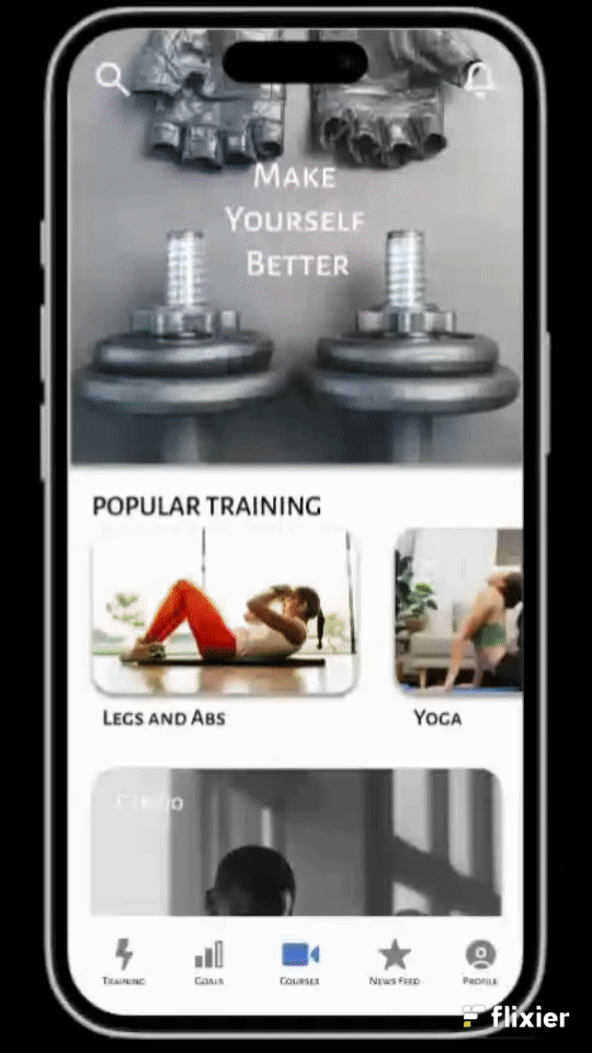
“I structured the app around five main sections — Home, Training/Workouts, Goals, Community, Profile — to make key actions reachable within two taps.”
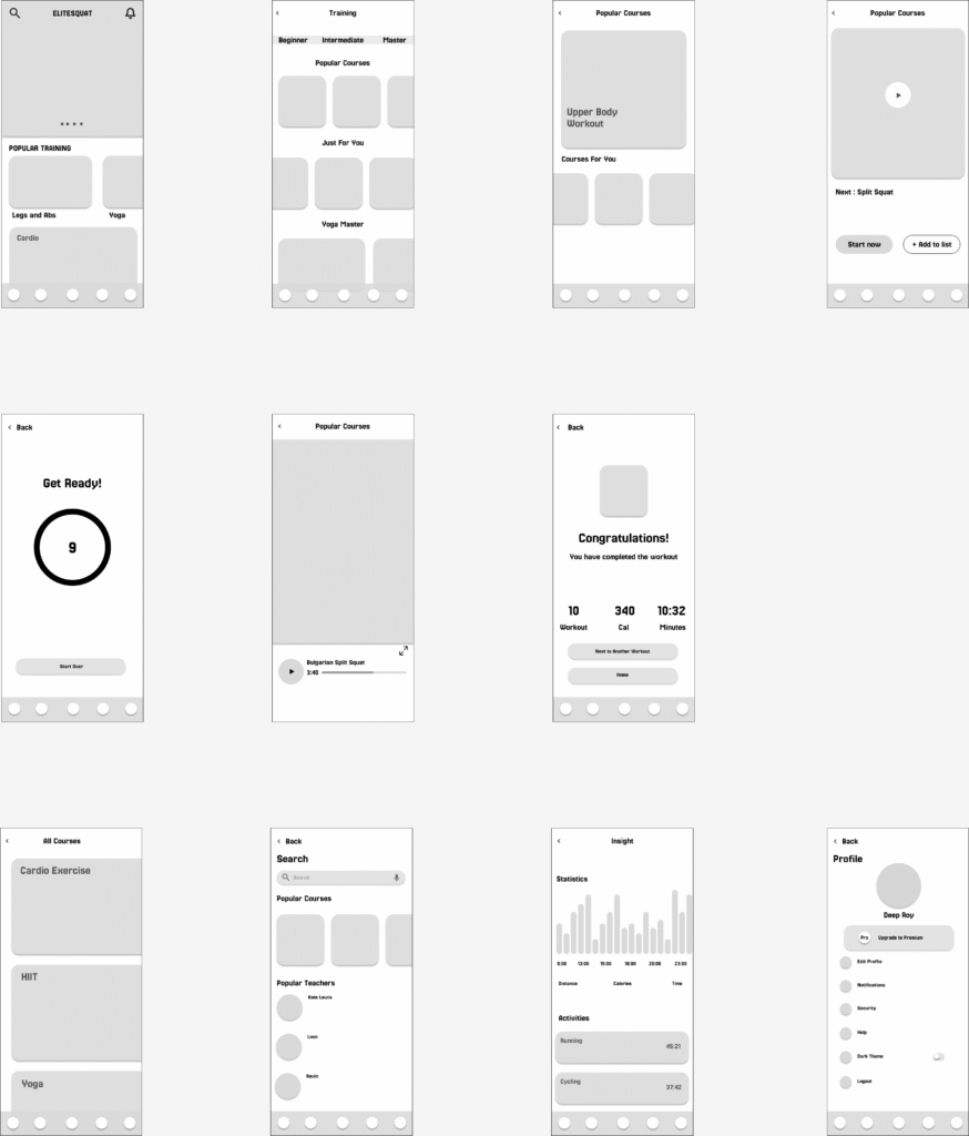
Low Fidelity Wireframing
Low Fidelity Prototype
High Fidelity Prototype
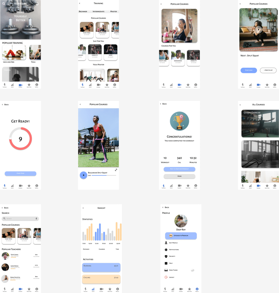
"I prioritized calm colors and minimal icons to reduce cognitive load and help users focus on starting their first workout. Each step encourages motivation through small rewards and visual progress.”
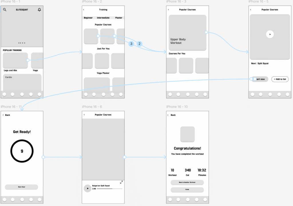
Usability testing
Getting your first workout done
Task 1: Start from the home screen and find your first workout.
Task 2: Choose a workout that fits your time availability.
Task 3: Begin the session and navigate through the workout (e.g. pause, next, skip).
Task 4: Congratulations you completed your first workout!!
Task5: View your results / summary or move on to next workout.
Number of users tested: 5
key findings:
“4 of 5 users completed their first workout without confusion.”
“Users requested a visible progress bar during workouts.”
“I refined the UI based on this feedback by enlarging the Start button and adding a visible session progress bar.”
Few Takeaways From This Project
This project taught me how motivation can be designed — not just triggered. I learned that visual simplicity and small rewards can be more effective than complex features.”
“Next time, I would test with more diverse users and explore integrating wearable data.”
Final App Design - Visual Appearance & Structure
Final UI screens (Home, Workout player, Progress page, etc.)